


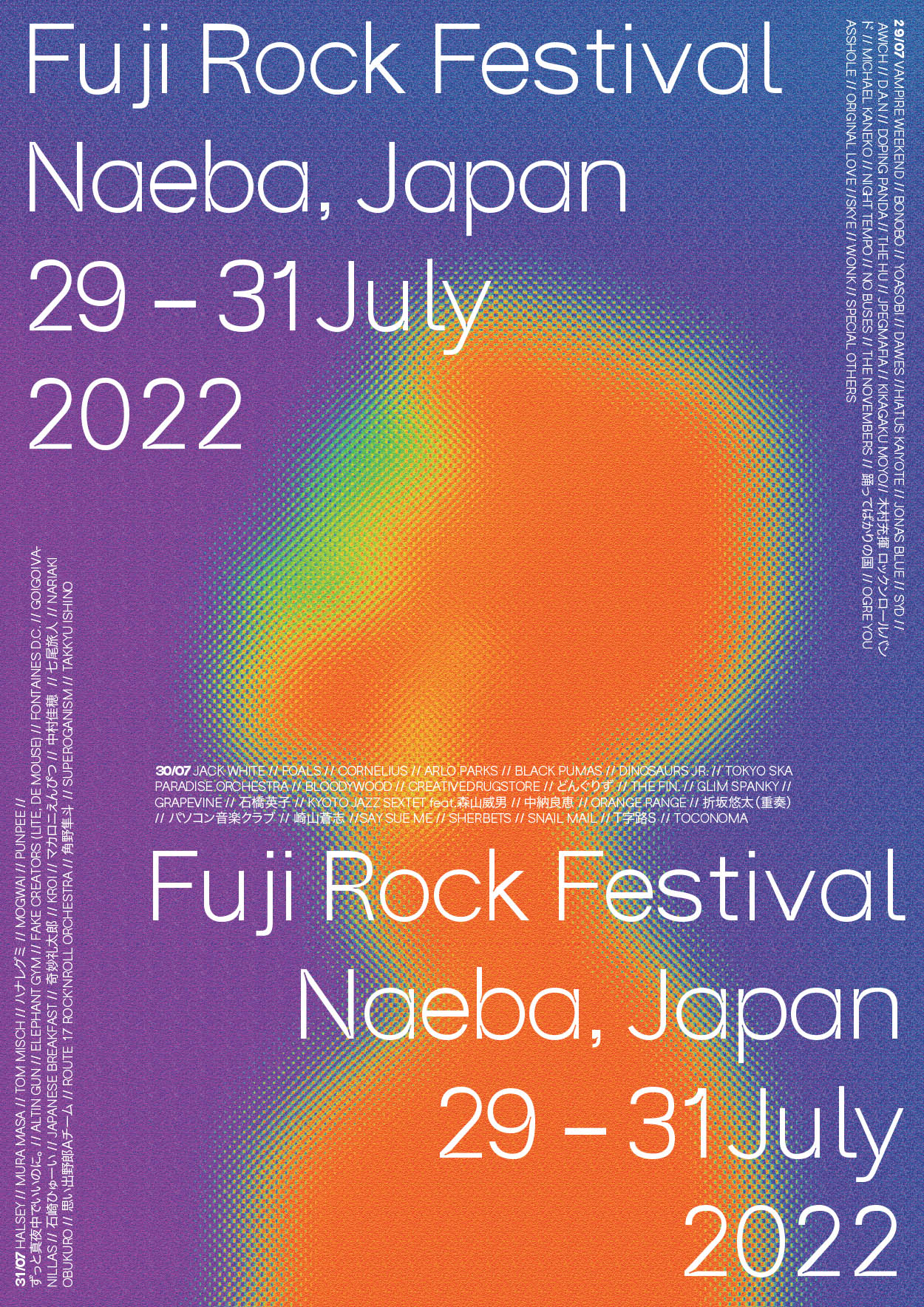
Festival Poster - Fuji Rock Festival 2022
We were tasked in the Communication Design Basics 2 course to make a poster for a festival of our choice. For my poster, I tried an experimental approach of playing with colour and texture that is befitting of a rock concert. As for the typographic layout, I chose a structured and minimal approach to balance out the ‘chaos’ in the background.
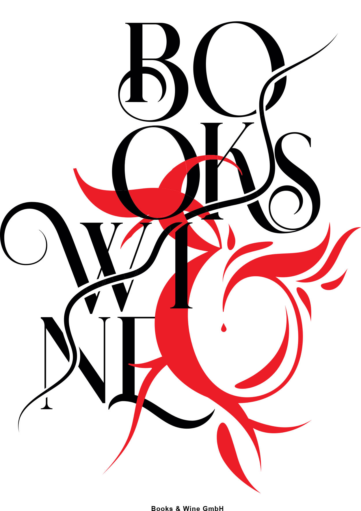
Books and Wine Poster
In the Communication Design Basics 2 course, we were tasked with making a poster for a fictional Book and Wine store. I decided very early on that I wanted to not use as obvious symbols such as a book or a wine glass, opting to go for something more abstract. The illustrative nature of the poster appeals to the idea of diving into a fantasy or a fictional world that can be heightened due to the influence of the alcohol from the wine.
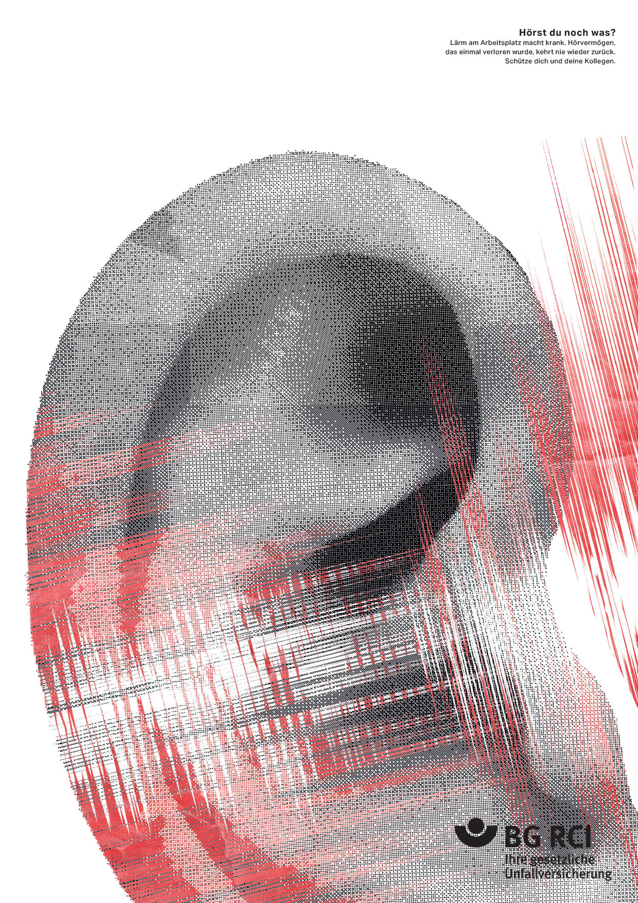
Noise at work
For our very first poster in the Communication Design Basics 2 course, we were tasked in designing a poster for a competition that year called ‘Lärm am Arbeitsplatz - Noise at Work’. Since it is a topic meant to inform the viewer of the danger of loud noises at work. In my poster, the ear is barely recognisable and heavily distorted which symbolises the harm that a worker would have if exposed to loud noises.
Name: Marcella Partzsch
Project Semester: 2nd
Professor: Christoph Zielke
Festival Poster - Fuji Rock Festival 2022
We were tasked in the Communication Design Basics 2 course to make a poster for a festival of our choice. For my poster, I tried an experimental approach of playing with colour and texture that is befitting of a rock concert. As for the typographic layout, I chose a structured and minimal approach to balance out the ‘chaos’ in the background.
Books and Wine Poster
In the Communication Design Basics 2 course, we were tasked with making a poster for a fictional Book and Wine store. I decided very early on that I wanted to not use as obvious symbols such as a book or a wine glass, opting to go for something more abstract. The illustrative nature of the poster appeals to the idea of diving into a fantasy or a fictional world that can be heightened due to the influence of the alcohol from the wine.
Noise at work
For our very first poster in the Communication Design Basics 2 course, we were tasked in designing a poster for a competition that year called ‘Lärm am Arbeitsplatz - Noise at Work’. Since it is a topic meant to inform the viewer of the danger of loud noises at work. In my poster, the ear is barely recognisable and heavily distorted which symbolises the harm that a worker would have if exposed to loud noises.
Name: Marcella Partzsch
Project Semester: 2nd
Professor: Christoph Zielke

